ADA Compliance Color Checker: How to Test and Fix Color Contrast Violations
Color contrast is the #1 web accessibility violation — and most checkers miss the failures hiding in dynamic states. Here's how to test your real site.
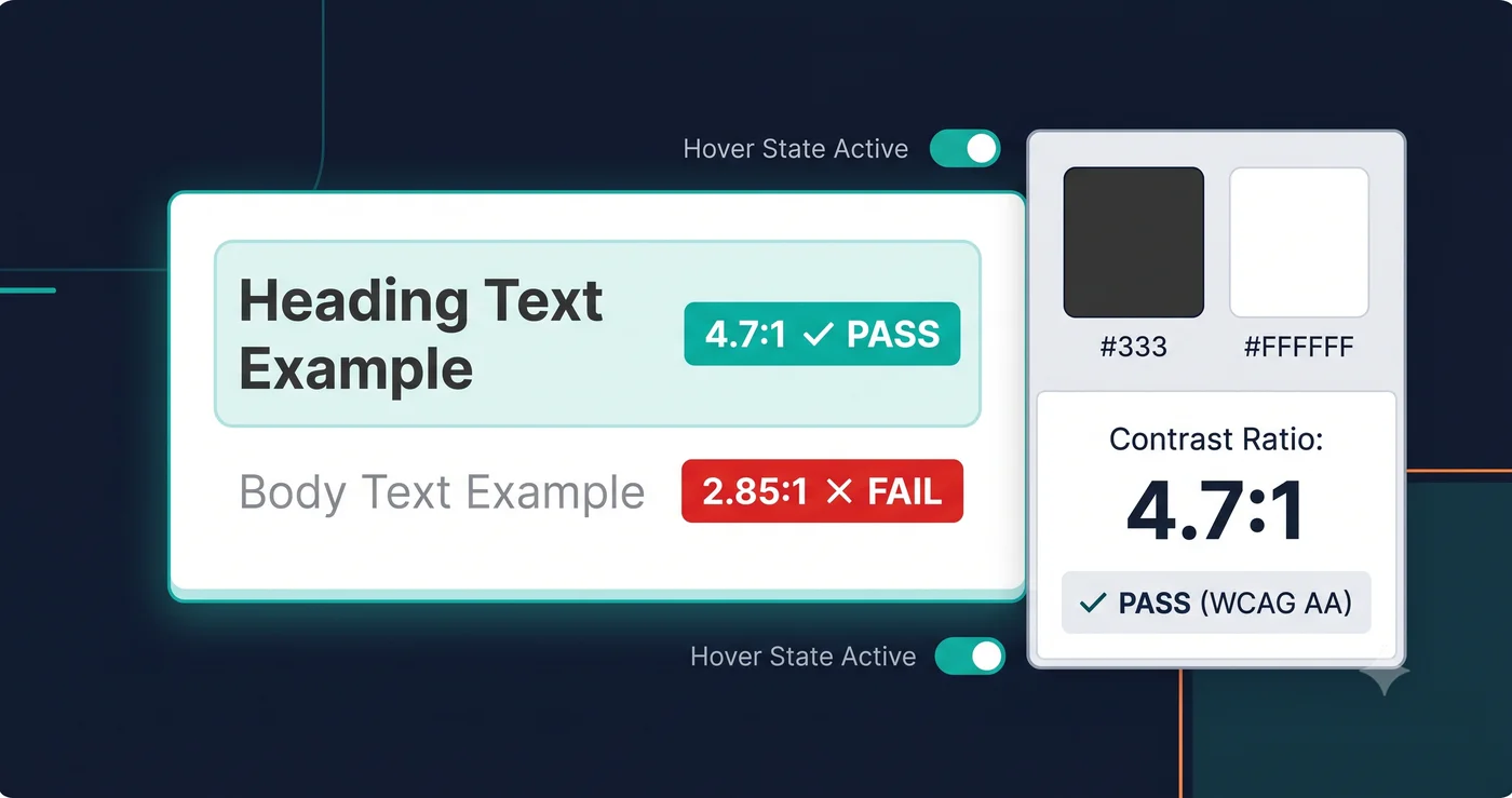
Color contrast is the most-cited accessibility violation in ADA demand letters — and it's also the one most site owners discover only after a law firm contacts them. If you can read your own site clearly, your brain fills in what users with low vision, cataracts, or color blindness cannot.
According to WebAIM's Million report, 83.6% of the top one million websites fail basic WCAG color contrast requirements. That figure has barely shifted in five years, which tells you something important: most teams are either not testing at all, or they're using tools that miss the failures hiding in the places automated checkers don't look.
An ada compliance color checker tests the contrast ratio between text and background colors against legally referenced thresholds. But not all checkers reach the same elements — and the gap between what a manual hex tool tests versus what a full-DOM scanner finds is exactly where the litigation risk lives.
What WCAG Requires for Color Contrast (and What ADA Ties to It)
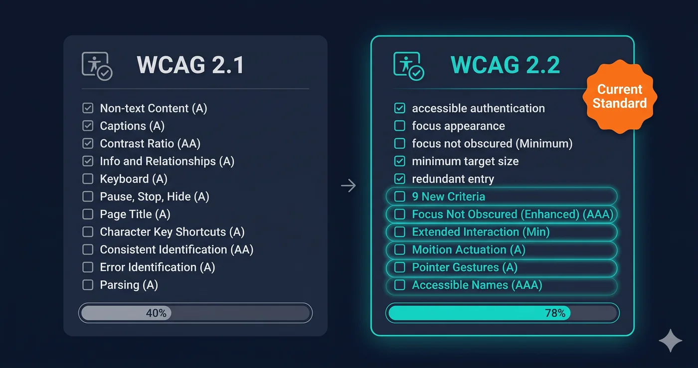
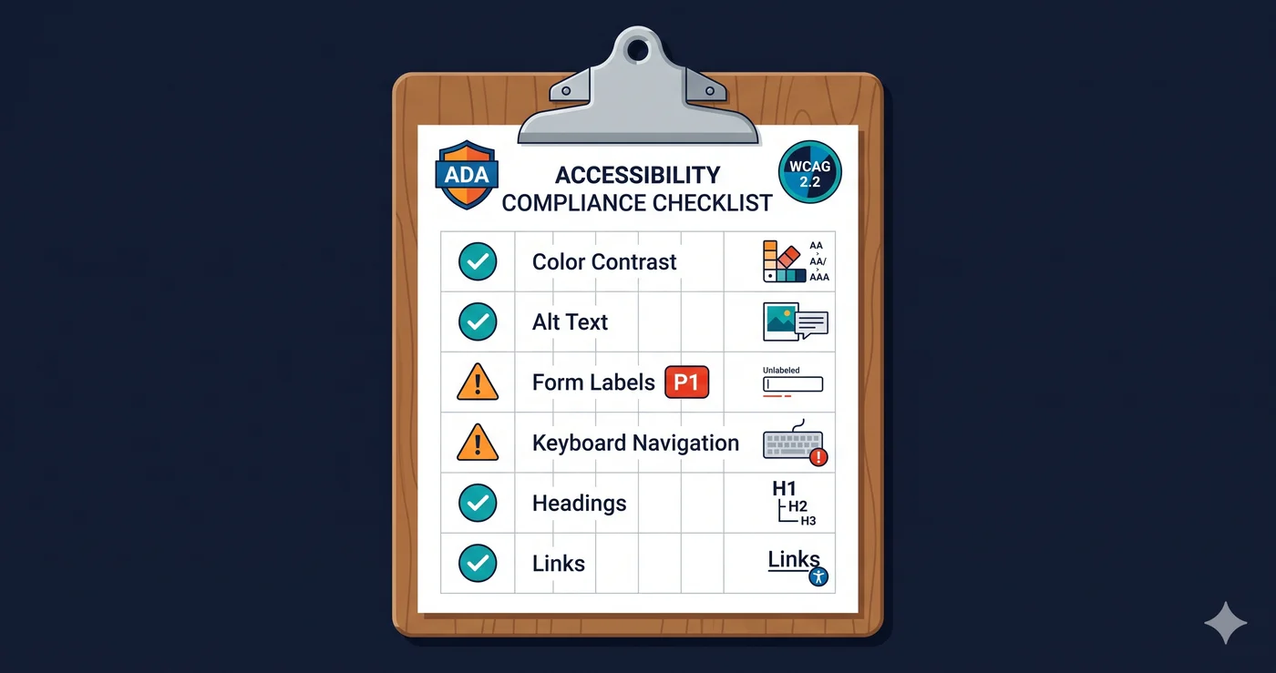
ADA Title III court guidance points to WCAG 2.1 Level AA as the working standard. WCAG 2.1 AA requires:
4.5:1 contrast ratio for normal text (under 24px or 18pt bold)
3:1 contrast ratio for large text (24px or 18pt bold and larger)
3:1 contrast ratio for UI components — form borders, focus indicators, icons
WCAG 2.2 added criterion 2.4.11: keyboard focus indicators themselves must achieve a minimum contrast of 3:1 against adjacent colors. This is a new failure point that most color contrast checkers built before 2023 don't test.
The ratios aren't arbitrary. Approximately 300 million people globally have some form of color vision deficiency (World Health Organization), and 2.2 billion people have near or distance vision impairment. Low-contrast text is functionally invisible to users with cataracts, glaucoma, or age-related macular degeneration — regardless of whether they use a screen reader.
What Most ADA Compliance Color Checkers Miss
Manual hex-input tools are useful for spot-checking design decisions in Figma. They are not useful for auditing a live website.
Here's why: your website has hundreds of text/background color combinations. Some only appear conditionally — when a field has an error, when a button is hovered, when an item is out of stock, when a form field is disabled. A developer would need to manually identify every single one of those states, capture the computed hex values, and enter each pair into a checker individually. Nobody does that.
A full ada compliance color checker that scans your rendered DOM catches what manual testing misses:
Element Type
Manual Hex Tool
Browser Extension
Full DOM Scanner (ADAGuard)
Static body text
✅
✅
✅
Placeholder text in form fields
❌
Partial
✅
Disabled button / input states
❌
Partial
✅
Error message text
❌
Partial
✅
Hover and active link states
❌
❌
✅
Focus indicator contrast (WCAG 2.4.11)
❌
❌
✅
JavaScript-rendered content
❌
❌
✅
Badge and label text on colored backgrounds
❌
Partial
✅
This gap is why sites pass a visual design review and still receive ADA demand letters. The violations are real — they're just in the states and elements that standard checkers never reach.
The Five Elements That Fail Ada Compliance Color Contrast Most Often
Based on scan data from thousands of site audits, these are the most commonly flagged failures:
1. Placeholder text — Designers often style placeholders in light gray (#999, #aaa) to distinguish them from typed input. Against a white background, that's typically a 2.9:1 to 3.5:1 ratio — well below the 4.5:1 required under WCAG 1.4.3. Placeholder text is one of the most-cited failures in ADA compliance color checker reports.
2. Disabled form elements — Reducing opacity to 50% is a common design pattern for disabled buttons and inputs. It tanks the contrast ratio of text that may have been 4.5:1 at full opacity to under 3:1. WCAG requires that disabled elements either meet contrast requirements or clearly indicate their inactive state through other means.
3. Footer and secondary navigation links — Footers frequently use medium-gray text on dark or colored backgrounds. The combination looks subdued by design but tests between 3.5:1 and 4:1 — just under the threshold. Ada compliance contrast checker scans flag these at scale.
4. Status badges and labels — Small "In Stock" or "Sale" badges combine small font sizes with brand-color backgrounds. Small text AND a colored background creates a double failure: the font is too small to qualify for the 3:1 large-text allowance, and the background color doesn't achieve 4.5:1.
5. Focus indicators — After WCAG 2.2, the keyboard focus ring must meet a 3:1 contrast ratio against its adjacent colors. Many sites have removed default browser focus styles (via outline: none) without adding a visible replacement. This creates a legal failure under both 2.4.7 (visible focus) and 2.4.11 (focus contrast).
What to Do When Your ADA Compliance Color Checker Finds Violations
Color contrast failures fall into two buckets.
Bucket 1: Pure CSS fixes — Text color, background color, and border color changes are stylesheet changes your developer can make in minutes, once they know which selectors to target. The critical input is the WCAG criterion number and the computed hex values from the scan report — not a vague description of "the form looks low contrast." A good ada compliance color checker scan report gives you the element, its computed colors, the actual ratio, and the required ratio. That's the ticket.
Bucket 2: Vendor-owned elements — If the failing element lives inside a third-party checkout widget, a Klaviyo popup, a Zendesk chat button, or a CMS theme component, your developer cannot simply rewrite that code. The fix requires either CSS overrides (which may break on vendor updates) or a formal support request to the vendor citing the specific WCAG criterion and element reference. The scan report gives you exactly the documentation you need for that ticket.
What you should not do: start making contrast changes based on a visual guess. Without a full ada compliance color checker scan across your live site, you will fix the violations you can see and miss the ones in dynamic states — which are often exactly the ones flagged in demand letters.
Why ADAGuard Catches More Than Other Color Checkers
ADAGuard uses a full-DOM scanner that runs your URL in a headless browser — the same rendering environment a real user experiences. This means:
JavaScript renders before the scan runs — no missing dynamic content
Every text/background pair in its computed (not declared) state is tested
WCAG 2.2 criteria including focus contrast (2.4.11) and non-text contrast (1.4.11) are included
Authenticated scanning is available for password-protected pages and logged-in states
ADAGuard covers approximately 78% of WCAG 2.2 AA criteria automatically (43 of 55). Its advantage shows up most clearly in dynamic states and non-text contrast, which is exactly where ada compliance color contrast failures hide.
WAVE and Lighthouse are excellent tools. But their browser extension or CLI architecture means they test the page as loaded, not in conditional states your users actually encounter.
The 30-Second Fix
You don't need a design sprint to know if your site has contrast violations. Paste your URL into the free website accessibility checker — no account, no signup, no credit card. The ada compliance color checker scan runs in under 30 seconds and returns every failing element with its computed ratio, the required ratio, the specific WCAG criterion, and the element selector. Take that report to your developer or vendor, and you've turned a vague legal concern into a specific fix list.
Color contrast violations appear on 83.6% of websites. The question is whether you know which ones are on yours.