Dark Mode Accessibility: Why a Theme Toggle Doesn't Satisfy WCAG Contrast
Giriprasad Patil·· 6 min read·Technical How-To
Color contrast is the number one accessibility failure on the web. According to WebAIM's Million analysis, 83.6% of all websites fail WCAG contrast requirements on at least one element. Adding a dark mode toggle to your site doesn't fix that statistic — for most teams, it creates an entirely new set of contrast failures that no one checked because the light mode tested fine.
The ada compliance color checker problem in 2026 is this: most teams test contrast for one theme. They pick colors for light mode, run them through a contrast ratio tool, confirm they pass 4.5:1, and ship. Then they add a dark mode using CSS custom properties, invert a few background variables, and assume the same colors will work in reverse. They rarely do.
## What WCAG Actually Requires for Contrast
WCAG 2.1 Level AA sets two minimum contrast ratios that apply to every color combination on your site — in every theme:
**1.4.3 Contrast (Minimum):** At least 4.5:1 for normal text (under 18pt regular or 14pt bold). At least 3:1 for large text (18pt+ regular or 14pt+ bold). This ratio applies to text against its immediate background.
**1.4.11 Non-text Contrast:** At least 3:1 for user interface components (buttons, form inputs, focus indicators, icons that convey meaning) against adjacent colors.
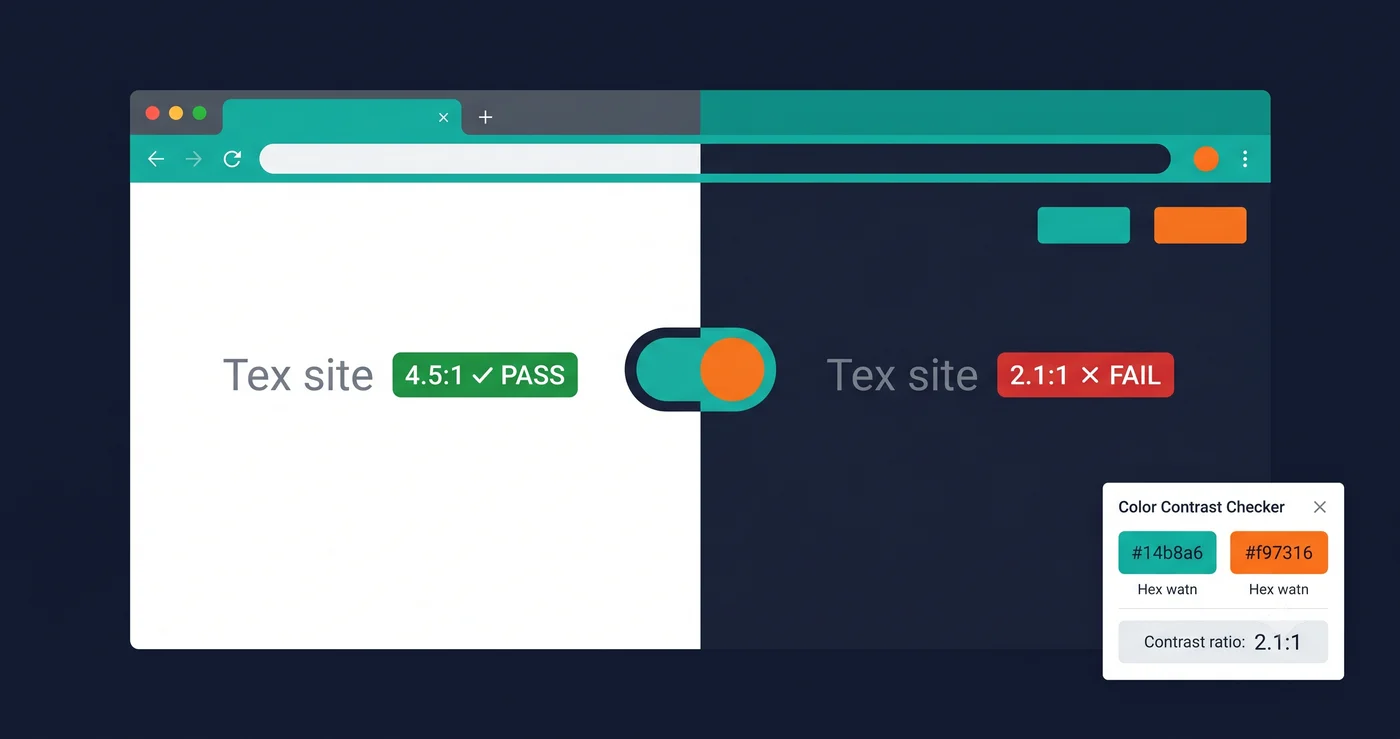
**Both thresholds apply independently to every theme.** A color pair that achieves 5.2:1 in light mode and 2.8:1 in dark mode is non-compliant. The dark mode version fails 1.4.3 regardless of the light mode result. If you offer a dark mode, you must run an ada compliance color checker against your dark theme separately.
## Why Dark Mode Creates New Contrast Failures
The instinct when building dark mode is to invert: swap your white background for a dark background, keep your brand colors, change your text from dark to light. This works visually for most colors. It fails accessibility for many.
**Pure black is too harsh, saturated colors "vibrate."** Accessibility specialists consistently recommend against using pure black (#000000) as a dark mode background. The extreme contrast between pure black and white text (21:1) can cause eye fatigue and halation effects for users with certain visual impairments. Industry standard dark backgrounds use very dark grays (#121212, #1e1e1e) rather than true black.
More importantly, fully saturated brand colors — the bright reds, oranges, and yellows that pop on a white background — often fail contrast requirements on dark backgrounds. A bright orange (#FF6B00) achieves 4.8:1 on white (#FFFFFF), passing AA. The same orange achieves only 3.1:1 on dark gray (#121212), failing AA for normal text. Same hex value, opposite compliance outcome depending on theme.
**Semantic states lose meaning in dark mode.** Error states (red borders, red text), success states (green badges), warning indicators (yellow icons) — these are color-coded signals that may pass contrast in light mode and fail in dark mode. Because they appear infrequently (only on form errors or validation), they're often the last thing tested. They're also the most legally significant: a form that cannot communicate an error state to a low-vision user is a direct barrier to completing a task.
## The `prefers-color-scheme` Problem
Developers who implement dark mode via CSS `prefers-color-scheme` — the media query that automatically switches the theme based on the user's OS setting — often never see the dark version in their browser during development. Their browser is in light mode. They build, test, and ship in light mode. The dark mode exists in the CSS and is served to users who prefer it, but no one on the team ran an ada compliance color checker against it.
A minimal but meaningful test workflow:
```css
/* In your browser DevTools — Forces dark mode for testing */
@media (prefers-color-scheme: dark) {
/* Your dark mode tokens go here */
}
```
In Chrome DevTools → Rendering tab → Emulate CSS media feature `prefers-color-scheme` → set to `dark`. This lets you view the dark theme without changing your OS setting, enabling contrast testing in the browser.
## What to Test and Where the Failures Hide
| UI Element | Light Mode Risk | Dark Mode Risk | WCAG Criterion |
|---|---|---|---|
| Body text | Low (if initially tested) | Medium — inverted palette may drop ratio | 1.4.3 |
| Placeholder text | High — often set to gray at 3:1 or less | Higher — same gray looks different on dark bg | 1.4.3 |
| Disabled button text | Medium — often intentionally low contrast | High — dark mode inversion makes it worse | 1.4.3 (Note 1 exception applies but check) |
| Form input borders | Medium — light gray borders on white fail 1.4.11 | High — dark mode border colors frequently fail | 1.4.11 |
| Focus indicator (outline) | High — default browser outline removed by CSS | Very High — dark mode often has no visible focus | 2.4.7 / 2.4.11 |
| Error state text | Low if checked | High — red on dark bg often fails | 1.4.3 |
| Icon color | Medium — icon-only elements need 3:1 | High — icon color may be inverted incorrectly | 1.4.11 |
| Link text color | Low if initially blue | Medium — dark mode link color often under-contrasted | 1.4.3 |
| CTA button | Low if checked | Medium — brand-color button on dark bg often fails | 1.4.3 + 1.4.11 |
## Testing Both Themes Systematically
The correct approach is to run your ada compliance contrast checker against both themes separately. For web surfaces, use the same tool you'd use for light mode — but capture the dark mode state.
For automated scanning, ADAGuard at [adaguard.io](https://www.adaguard.io) scans your site's live-rendered DOM including JavaScript-applied styles. If your dark mode is applied via a class toggle (e.g., `class="dark"` on ``), you can share the dark-mode URL or state with a scanner that supports URL parameters. ADAGuard's ada compliance color checker functionality is part of its full 22-category scan, covering contrast ratios across the rendered page alongside form labels, alt text, ARIA, and focus indicators.
For manual review, use the browser DevTools color picker or tools like the Colour Contrast Analyser desktop app to spot-check your most common text/background combinations in both themes.
## Building Contrast Compliance Into Your Design System
The highest-leverage fix is upstream: define accessible dark mode color tokens at the design system level, not per-component.
Rather than allowing any designer to use any color on any dark background, pre-define an approved palette for dark mode that has been verified against 4.5:1 for text and 3:1 for UI components. Document which combinations are approved, which are prohibited, and which require special consideration (large-text only, icon-only with text label). Build this into your Figma variable library or design tokens spec so that the contrast requirements are enforced at the design stage, not discovered in a post-launch ada compliance color checker audit.
The EAA has been in enforcement since June 28, 2025, and color contrast is one of the most easily detected violations — regulators and plaintiff attorneys can run automated checks against your dark theme just as easily as your light theme.
## The 30-Second Fix
Run an ADAGuard scan right now. Paste your URL at [adaguard.io](https://www.adaguard.io) — no signup required — and get a full WCAG 2.2 AA report including color contrast analysis in under 30 seconds. ADAGuard checks both contrast thresholds (1.4.3 and 1.4.11) across your live-rendered page, plus 20 other check categories covering ARIA, form labels, alt text, and focus indicators. See exactly which contrast failures exist on your current theme — then run the same scan on your dark mode state before a regulator or plaintiff attorney does it for you.