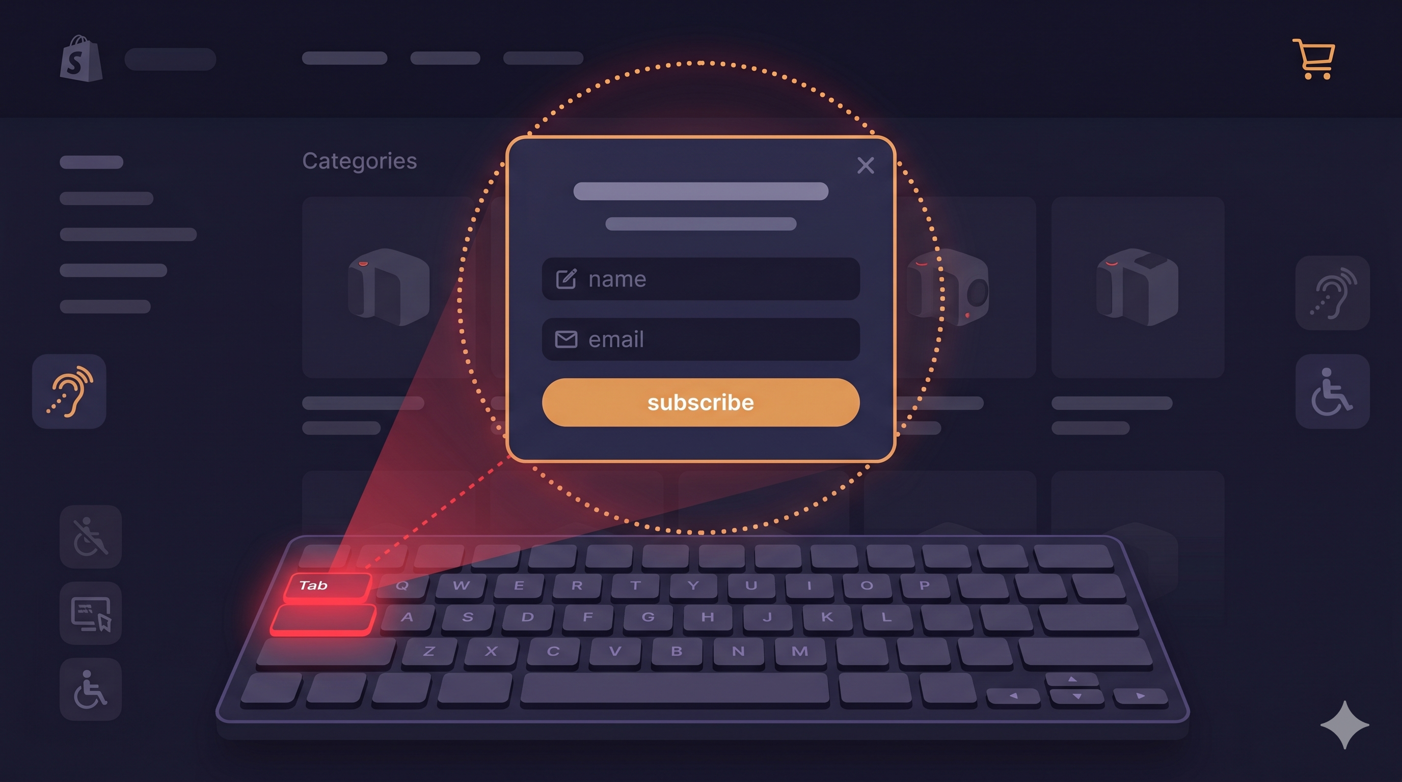
Close your mouse. Tab through your website. Now try to close the Privy popup that just appeared.
If you couldn't do it — if Tab didn't reach the close button, if Escape didn't work, if you ended up stuck in a loop between the email field and the Submit button with no way out — you just experienced what approximately 7.6 million Americans with motor disabilities experience on sites that use Privy or similar email capture tools (CDC Disability and Health, 2023).
This is a keyboard trap, and it violates WCAG 2.1.2 — a Level A accessibility requirement. Level A is the baseline. Courts have treated Level A failures as among the clearest indicators of ADA non-compliance. And more than 2,000 ADA website accessibility lawsuits were filed in just the first half of 2025, a 37% increase over 2024 (UsableNet, 2025 Mid-Year ADA Report), with email capture popups consistently identified as a trigger point.
Privy's documentation states the company has "empowered users to adhere to ADA compliance regulations" by ensuring visitors can identify displays as separate modals, focus on text, close the display, and tab through elements. The gap between that documentation and real-world screen reader and keyboard testing is the subject of this post.
What Privy Gets Right — and Where It Falls Short
Privy has put thought into ADA compliance more than many competing email capture tools. According to their official help documentation, standard Privy popups and flyouts (classified as modal dialogs) include:
- The ability to identify the popup as a separate modal from the page
- Keyboard focus on elements within the display
- Tab navigation between display elements
- Close functionality
That's a reasonable baseline. But baseline isn't the same as compliant, and several failure patterns appear consistently in real-world testing of Privy displays across Shopify stores.
| Privy Display Type | Compliance Classification | Known Issues |
|---|---|---|
| Popups (modal) | Dialog — ADA rules apply | Focus return on close; screen reader announcement |
| Flyouts (modal) | Dialog — ADA rules apply | Focus trap completeness; aria-modal attribute |
| Bars | Not a modal — different rules | Keyboard reachability of form elements |
| Embedded forms | Not a modal — different rules | Label association, error announcement |
| Landing pages | Not a modal — different rules | Full page WCAG compliance required |
Privy explicitly notes that bars, embedded forms, and landing pages are "not considered dialogs or modals for ADA compliance purposes." This is technically accurate but potentially misleading: those elements still need to meet WCAG standards — just different ones (labeling, contrast, error identification) rather than dialog-specific requirements.
The Keyboard Trap Distinction: Permissible vs. Impermissible
There's a genuine nuance in WCAG that's worth understanding. A "focus trap" inside a modal dialog is not automatically a WCAG violation — in fact, properly implemented focus trapping inside an open modal is a WCAG best practice. When a dialog is open, focus should stay inside it to prevent users from accidentally interacting with inert background content.
The violation is when the trap has no exit. WCAG 2.1.2 (No Keyboard Trap) requires that if focus is moved to a component, the user must be able to move focus away using only standard keystrokes. For a modal dialog, this means:
- Escape key must close the modal and release focus
- Tab through all elements must eventually reach the close button
- Close button must be keyboard-operable and have a descriptive label
A Privy popup that traps focus inside itself (good) but doesn't provide an accessible way out (bad) fails WCAG 2.1.2. This is the failure pattern most commonly reported by screen reader users interacting with Privy displays.
Focus Return: The Overlooked Requirement
Even when merchants get the popup navigation right, they often miss a subtler requirement: focus return. WCAG 2.4.3 (Focus Order) requires that when a dialog closes, keyboard focus returns to the element that triggered it.
For Privy popups triggered automatically on page load or by scroll/time behavior — which is the most common deployment — there's no single trigger element to return to. In these cases, best practice is to return focus to the first focusable element in the underlying page, or to the element the user was interacting with before the popup appeared.
What commonly happens instead: focus drops to the document root, and the next Tab keypress takes the user back to the browser address bar or the first link in the page header. For a user who was mid-way through browsing a product page, this means tabbing through every navigation element, every header link, and every section header before reaching the product information again. It's not a crash, but it makes the site substantially harder to use — and "substantially limits" usage is exactly the language the ADA and courts use.
Screen Reader Announcements: What Privy Misses
When a modal dialog opens on a web page, screen readers need to be told. The mechanism is programmatic: the dialog container needs role="dialog" and aria-modal="true" to signal that a modal overlay is active, plus aria-labelledby pointing to the dialog's heading to give screen reader users context about what they've just entered.
Without these attributes, screen readers don't know a modal has opened. A JAWS or NVDA user continues to perceive the page as-is, with no indication that a dialog requiring their attention is present. They'll discover it only if they happen to Tab into it, which may not occur for some time.
A properly structured Privy popup container should include:
<div
  role="dialog"
  aria-modal="true"
  aria-labelledby="privy-popup-heading"
  aria-describedby="privy-popup-desc">

  <h2 id="privy-popup-heading">Get 10% Off Your First Order</h2>
  <p id="privy-popup-desc">Sign up for email updates to receive your discount code.</p>

  <!-- Form content -->

  <button aria-label="Close signup popup" autofocus>
    <span aria-hidden="true">×</span>
  </button>
</div>
The autofocus attribute on the close button (or first interactive element) ensures that when the dialog opens, focus immediately moves inside it — satisfying WCAG 2.4.3 for the opening event.
The Close Button Problem in Privy
Privy's close button is typically an X icon or close symbol in the upper-right corner of the display. Like most close buttons in email capture tools, it often lacks a programmatic accessible name — it's identified by screen readers as "button" with no further context, or reads the raw × character.
The WCAG failure here is 4.1.2 (Name, Role, Value): interactive elements must have an accessible name. A button labeled only with a visual × character doesn't have one.
The fix is straightforward and can usually be applied via Privy's custom code block:
/* Privy close button accessible label — add via custom CSS/JS */
// Find Privy close button and add aria-label
document.addEventListener('DOMContentLoaded', function() {
  const observer = new MutationObserver(function() {
    const closeBtn = document.querySelector('.privy-dismiss-text, [data-testid="dismiss-button"]');
    if (closeBtn && !closeBtn.getAttribute('aria-label')) {
      closeBtn.setAttribute('aria-label', 'Close popup');
    }
  });
  observer.observe(document.body, { childList: true, subtree: true });
});
Because Privy injects the popup into the DOM dynamically, a MutationObserver is needed to catch the element after it appears rather than on initial page load.
Testing Your Privy Display Properly
Effective testing for Privy accessibility requires:
Keyboard-only test (5 minutes): 1. Load your store — trigger the popup 2. Close your mouse 3. Can you Tab to the close button? 4. Does Escape close the popup? 5. After closing, where does focus land? (Should be on a meaningful page element) 6. Tab through the email field, submit button, and any other interactive elements — do they all respond to keyboard input?
Screen reader test (10 minutes): 1. Install NVDA (free) or use VoiceOver on Mac (built-in) 2. Load your store — trigger the popup 3. Does the screen reader announce that a dialog has opened? 4. Does it read the dialog's title/heading? 5. Can you navigate to all form elements and hear their labels? 6. Can you activate the close button and hear it announced correctly?
Automated scan: ADAGuard's live-DOM scanner at adaguard.io catches the static WCAG violations — missing aria labels, contrast failures, heading issues — and because it evaluates the rendered DOM, it sees Privy's dynamically injected popup content that static scanners miss.
What About Bars and Embedded Forms?
Privy bars (the thin notification bar at the top or bottom of the page) and embedded signup forms are technically not dialogs and don't carry the same focus management requirements. But they're not off the hook for accessibility compliance.
For bars, the critical checks are: Is the email input labeled (not just placeholder text)? Is the submit button keyboard accessible? Does the bar have sufficient color contrast against the surrounding page?
For embedded forms, all of the above apply plus: Are error messages associated with their fields via aria-describedby? Are required fields marked with aria-required? Does the form submission provide programmatic feedback (not just a visual "success" message)?
Placeholder text alone — "Enter your email" inside the input field — does not constitute an accessible label. It disappears when the user starts typing, leaving screen reader users without any cue about what the field expects. WCAG 1.3.1 and 3.3.2 both require persistent, associated labels.
The 30-Second Fix
Open adaguard.io, paste your store URL, and run a free live-DOM scan — no signup required. ADAGuard covers 19 WCAG check categories including all the Privy-specific failure patterns described above: missing ARIA labels, contrast failures, empty interactive element names, and heading issues. The scanner executes JavaScript before evaluating, so it sees Privy's dynamically injected popups rather than the static page shell.
For comprehensive coverage, combine the automated scan with a 5-minute keyboard-only test. Together, they'll surface the specific violations most likely to appear in an ADA demand letter — before the demand letter arrives.