A Dark Mode Palette That Passes WCAG: The Contrast Values, Checked
Colours that pass WCAG contrast on white often fail on a dark surface. Here is a dark palette with every ratio measured by the WCAG formula — text at 4.5:1, borders at 3:1 for WCAG 1.4.11 — and the light-mode values that fail when you reuse them.
Adding dark mode usually means swapping a few CSS variables. The light-theme colours were checked against white; nobody checks them again against the new dark background — and many of them fail.
This post walks through a dark palette with every ratio measured using the WCAG contrast formula, so you can copy the values or the method.
What WCAG asks for
Text (1.4.3, Level AA): at least 4.5:1, or 3:1 for large text — 24px and up, or about 18.7px (14pt) bold and up.
UI components and graphics (1.4.11, Level AA): at least 3:1 for the visual information needed to identify a control — an input's border, a checkbox's outline, a focus indicator — against the colours next to it.
WCAG sets minimums, not a maximum: pure white on pure black (21:1) passes. Many design systems still soften it — off-white text on a charcoal background — because they find it more comfortable to read. That's a design choice, not a WCAG requirement.
Light-mode colours that fail on dark
Reusing light-theme tokens is where most dark-mode failures come from:
Colour
On #FFFFFF
On #0B0F19 / #0F172A
Muted text #475569
7.58:1 — passes
2.53:1 on #0B0F19 — fails
Link #2563EB
5.17:1 — passes
3.45:1 on #0F172A — fails for body text
Muted text #64748B
4.76:1 — passes
3.75:1 on #0F172A — fails for body text
A colour that works on white needs to be lighter, and usually less saturated, on a dark surface.
A dark palette, measured
Two surfaces — the page background and a raised surface for cards and inputs — and every colour that sits on them:
[ CSS ]
[data-theme="dark"] {
  --surface: #0b0f19;        /* page background */
  --surface-raised: #1e293b; /* cards, inputs, menus */
  --text: #e2e8f0;           /* 15.53:1 on surface, 11.87:1 on raised */
  --text-muted: #94a3b8;     /*  7.47:1 on surface,  5.71:1 on raised */
  --link: #60a5fa;           /*  7.53:1 on surface,  5.75:1 on raised */
  --border-control: #64748b; /*  4.02:1 on surface,  3.07:1 on raised */
}
Every text colour clears 4.5:1 on both surfaces, so text can sit on either. The control border clears 3:1 on both, which is what WCAG 1.4.11 needs for an input or button whose edge is the only thing showing where it is.
Borders, surfaces and 1.4.11
Two things are often confused here:
A control's boundary must reach 3:1 when that boundary is how someone finds the control. An input field drawn only as a thin border needs that border at 3:1 against the background — hence --border-control above. A border at #334155 looks fine in a mock-up but measures 1.85:1 on #0B0F19, which fails.
A card's background doesn't have to reach 3:1 against the page. #1E293B on #0B0F19 is only 1.31:1, and that's fine for a decorative card whose content is identified by its text. It matters only when the fill is the only cue that something is a control.
In light mode, shadows often do the work of separating surfaces. They nearly disappear on dark backgrounds, so use slightly lighter surfaces for raised layers and real borders where a control needs one.
Check your own values
Before shipping a dark theme, list every text and border colour against every surface it can sit on, and measure each pair. The color contrast checker gives the ratio for any two colours and suggests the nearest ones that pass. For the wider picture, see dark mode and WCAG contrast.
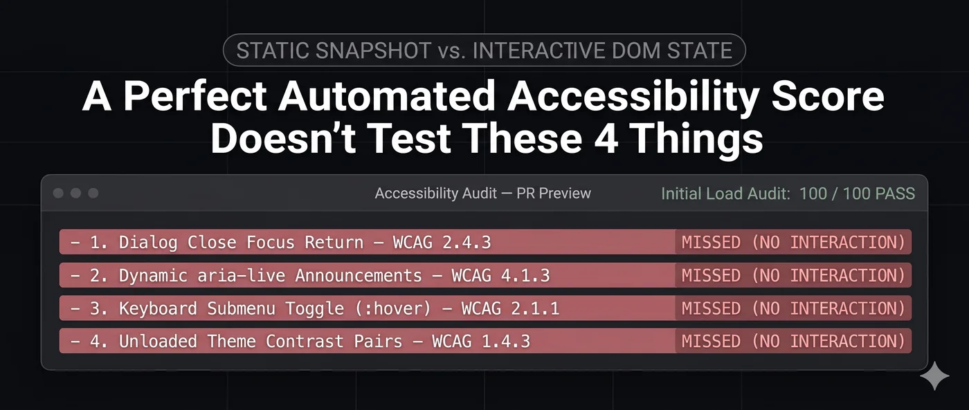
A page scan measures the theme the page loads in, so check the other theme's pairs directly, as above.